
Old Personal Logo - Concepts
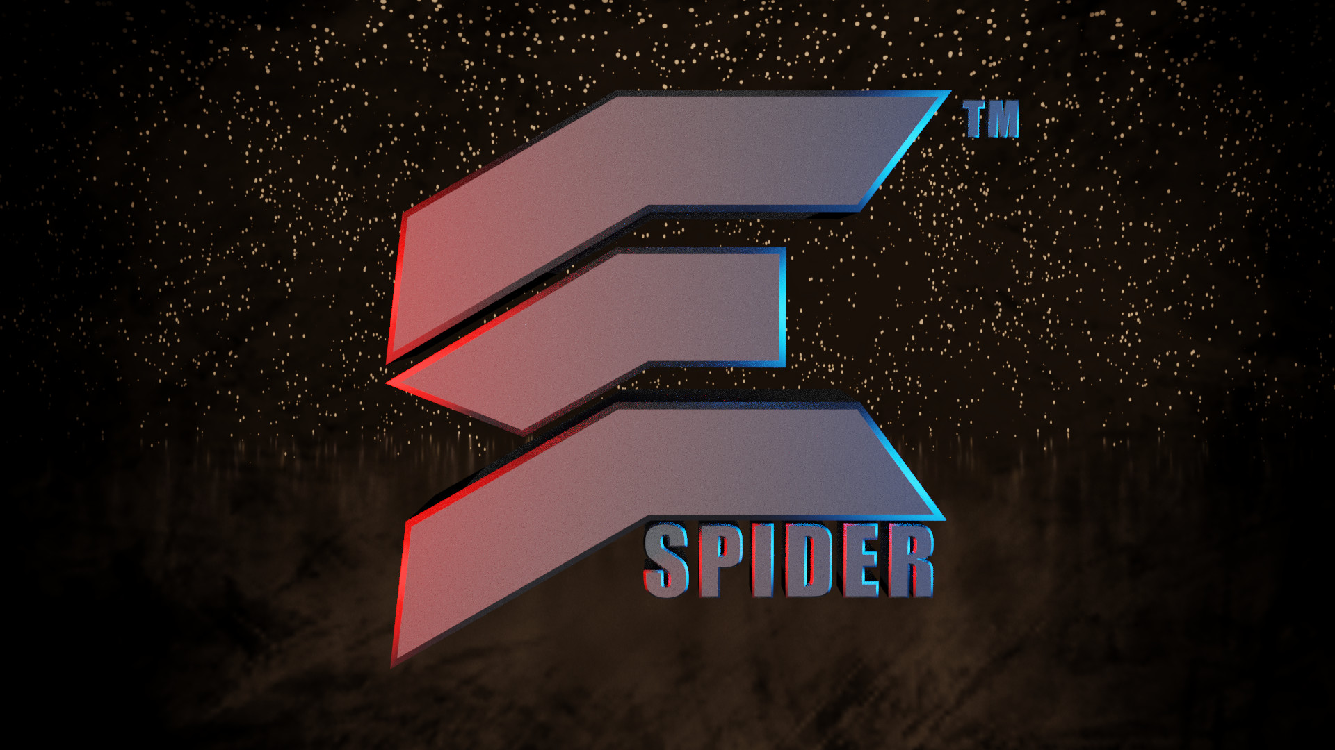
The final logo concept render test
Created in 2D w/in Photoshop. Here I'm testing the new text font, I'm developing.
I did not create the PSD file. I simply manipulated it some.
Simple 3D test
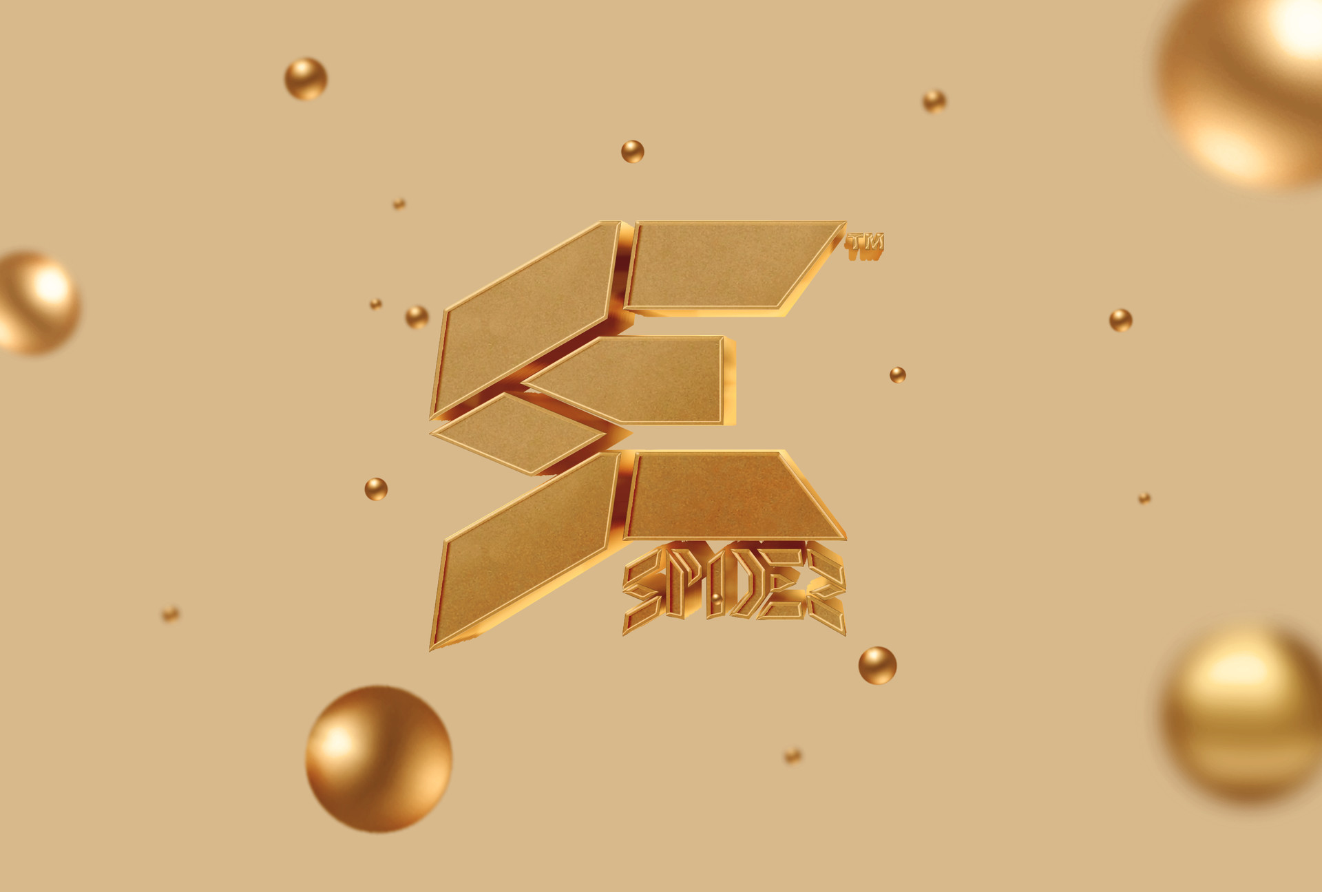
Logo Progress.
From current/old to new.
Trying to hammer in the primary element of the "SE".
I needed to update my logo to represent the SEspider brand. Although I still very much liked my current logo, it just doesn't hold up over time. Nothing about it identified it as a SEspider brand. as a result I attempted to create a more modern logo that had a chance to last.
The design itself is the "SE" in "SEspider". Although I love the boldness and simplicity of the shapes, the "S" doesn't exactly show through enough. I've gone through a fair number of different versions, and I believe I know which one I want to settle on. But I'll like some feedback before I lock myself into it. As I said, this is a personal project, so I'm trying to not put too much time into the design side.
Once I have the primary element of the logo down, I'll go into the "spider" element. And adjust it to match the main element. Feedback is a must in this. I'm simply too close to this project to truly criticize it.
UPDATE
I've since scraped this design entirely.
Although it worked well enough for social media sites like YouTube, it simply came off far too childish.
I have since moved to a more cooperate design